Because we know that devoting the time to truly understand the deep mechanics of every client is a crucial first step in creating genuinely good and longlasting work.
 We are (not afraid of being) a small agency. On the contrary – being a small group gives us flexibility and allows us to build closer relations to our clients. Also – it allows us to dedicate more work hours to doing what we do best: creating great and meaningful work.
 or less-than-optimal solutions. We undertake all parts of the design proces and do so with equal passion.
 We really just love what we do!
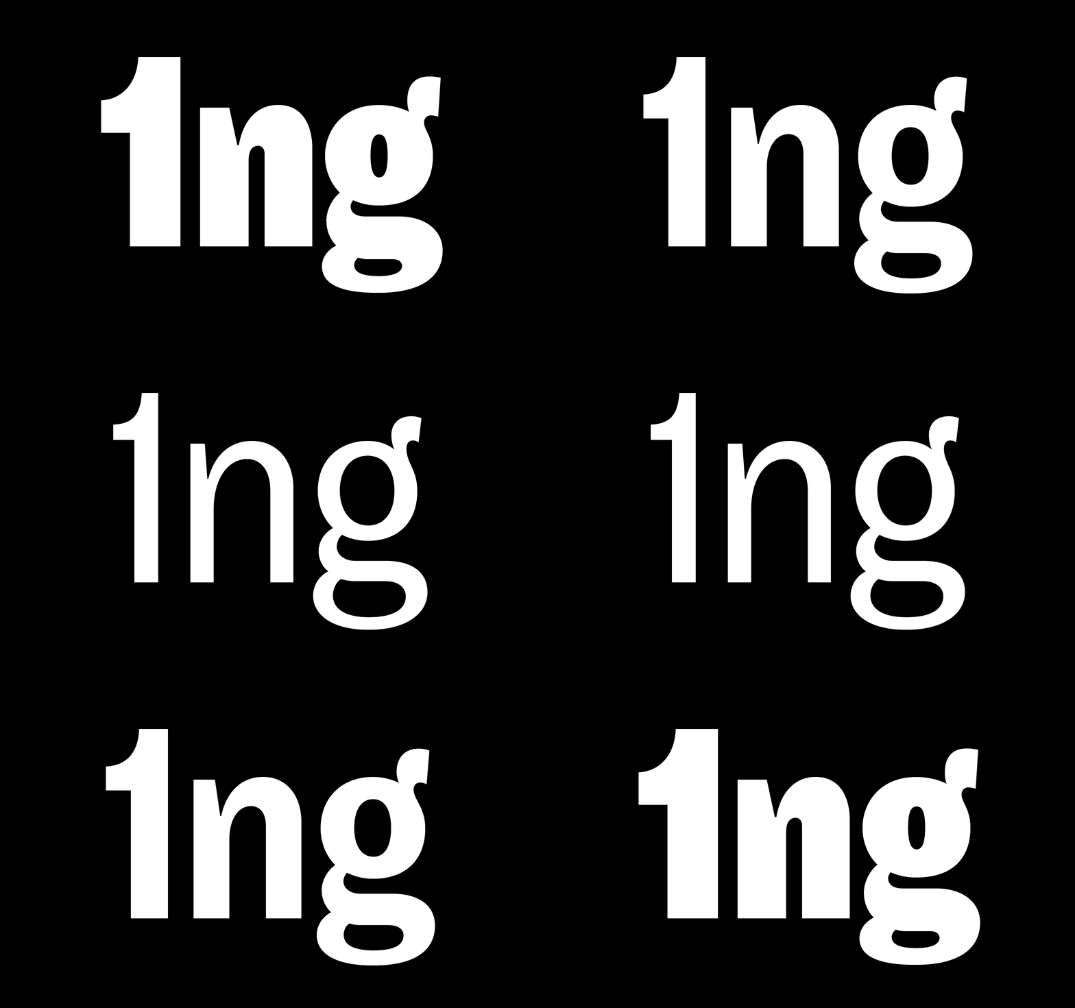
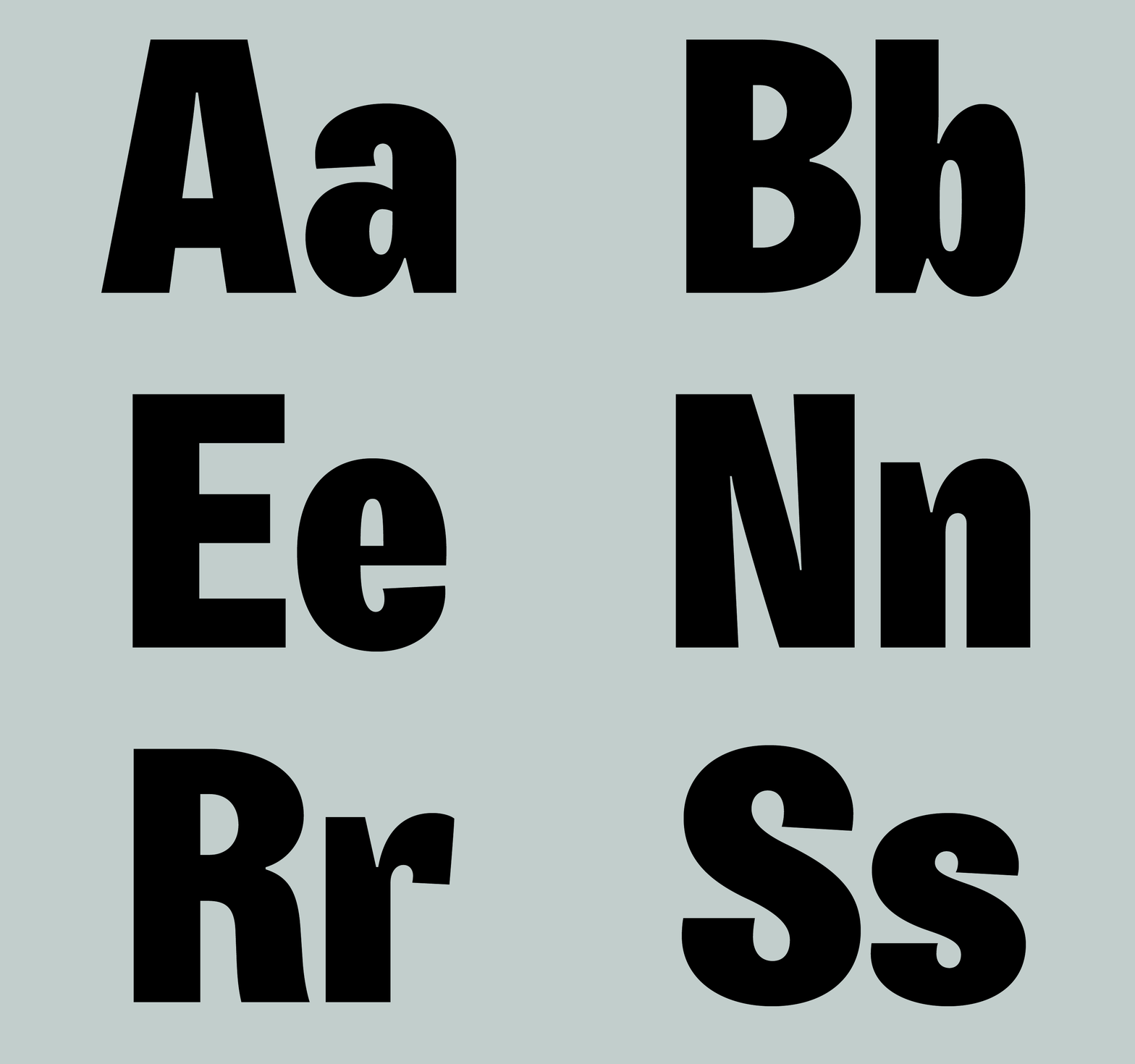
Berg is a typeface that exaggerates the form of the classic grotesque-style
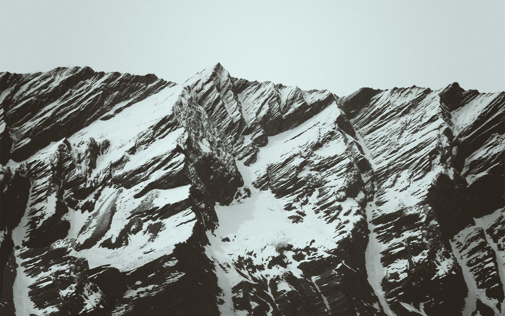
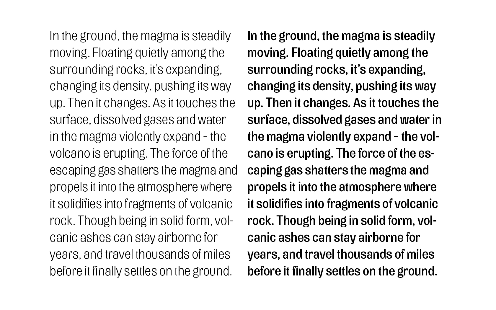
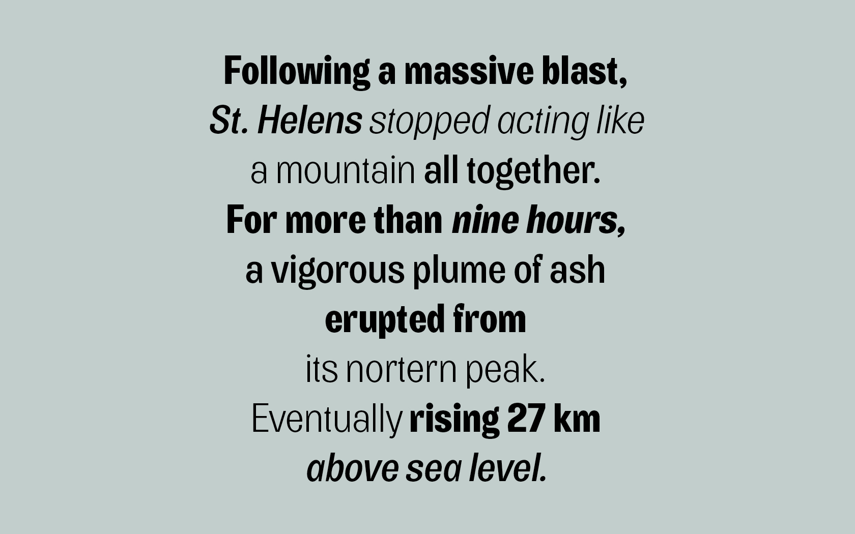
The ‘Grotesque’ is a distinct style in typography. And though 200 years of type design has evolved numerous sub-styles and thousands of truly different typefaces, certain forms invented with the early grotesques still endure – like a solid and withstanding foundation.
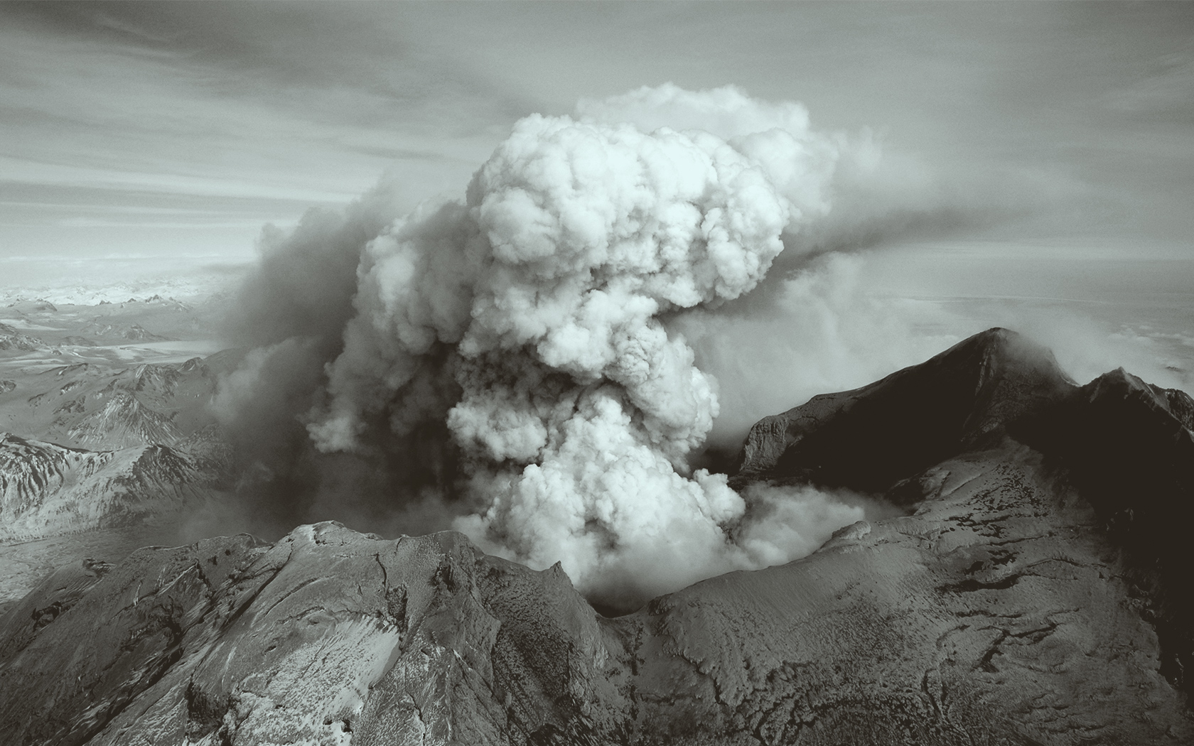
Berg (meaning mountain) explores the nature of these forms by drawing them into a state of exaggeration. From the massive cuts near the bottom joint of ‘a’ to the cringed terminal in ‘e’. The exaggerated forms gives Berg its distinct appearance.
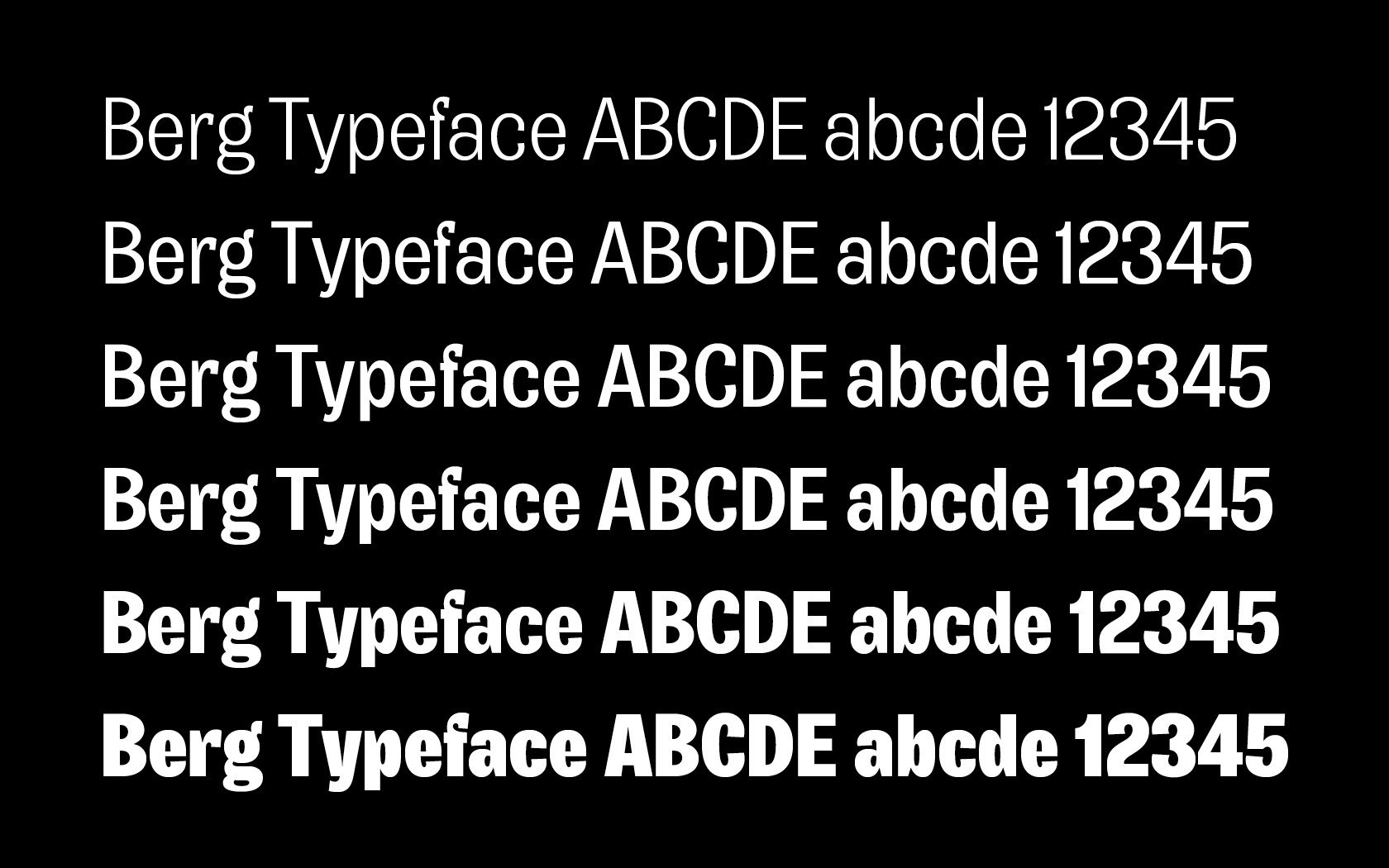
Berg is a 6 weight typeface – available on request.