Because we know that devoting the time to truly understand the deep mechanics of every client is a crucial first step in creating genuinely good and longlasting work.
 We are (not afraid of being) a small agency. On the contrary – being a small group gives us flexibility and allows us to build closer relations to our clients. Also – it allows us to dedicate more work hours to doing what we do best: creating great and meaningful work.
 or less-than-optimal solutions. We undertake all parts of the design proces and do so with equal passion.
 We really just love what we do!
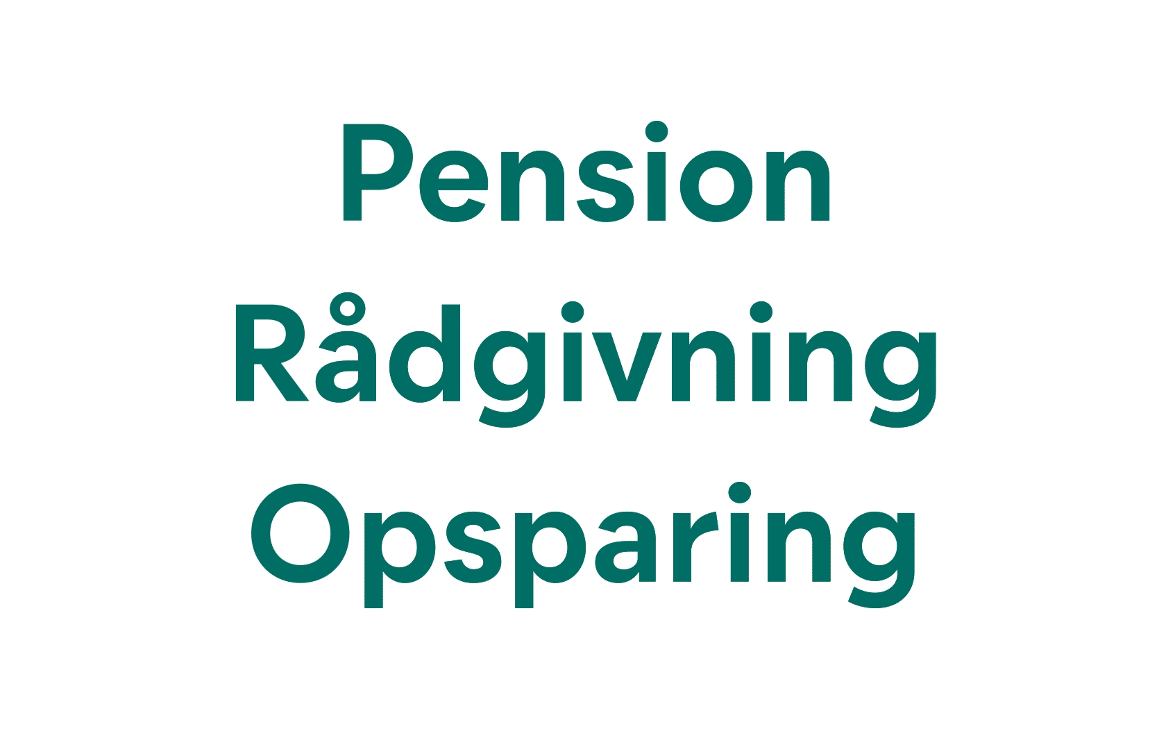
Brand typeface for the pension company Velliv
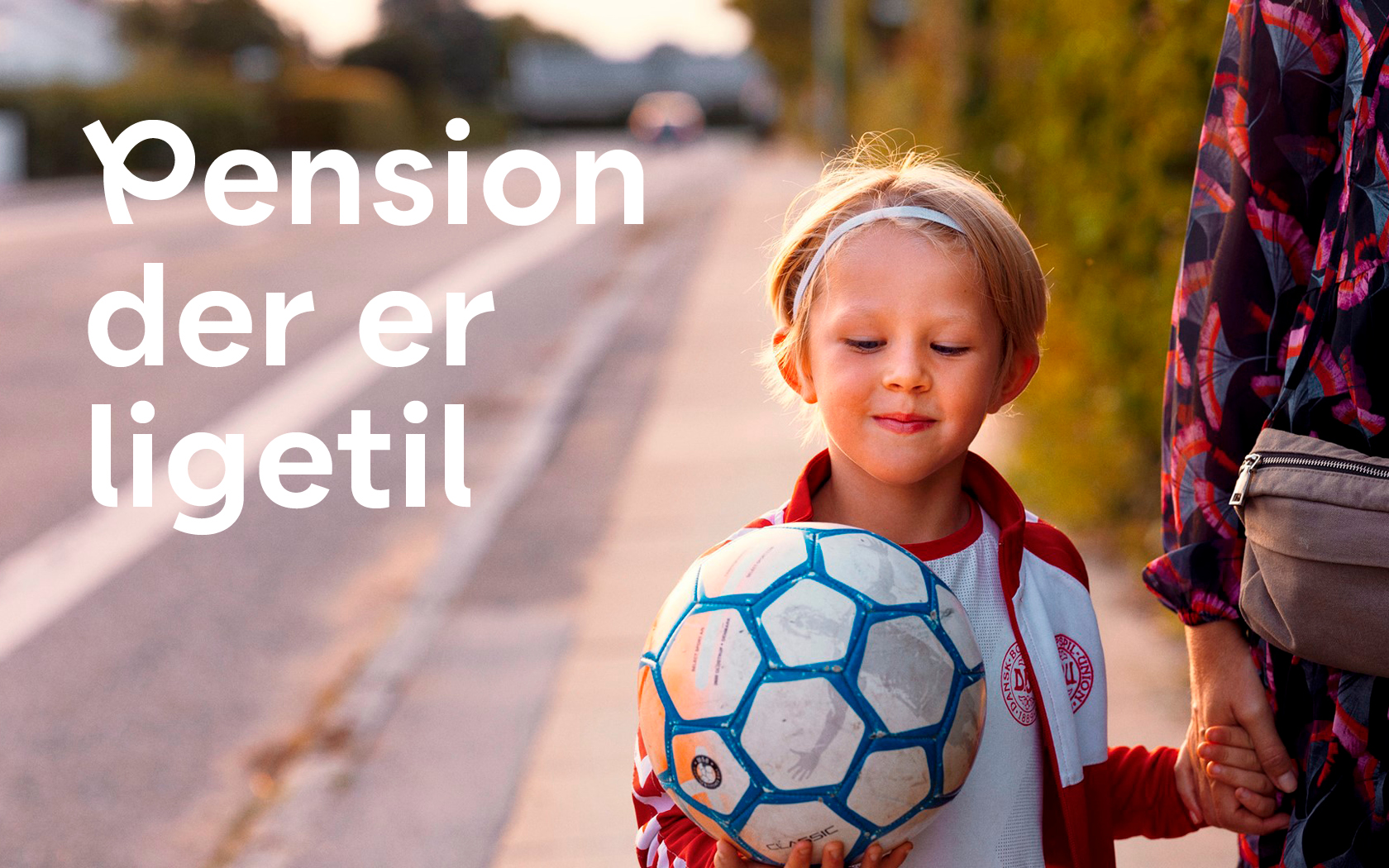
Life is indeed not a straight line. It changes, twists and takes unsuspected turns along its way (thankfully). The line that runs throughout Velliv’s graphics are a metaphor for this – and so are alternate characters of Velliv’s type family.

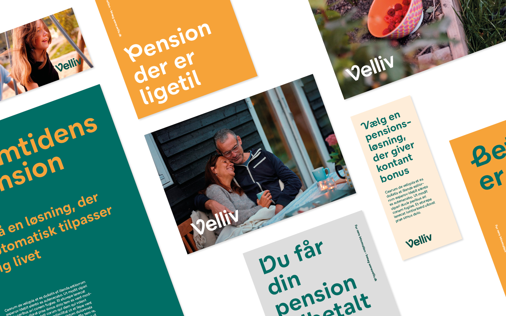
Velliv was founded in 2019 with the intention to be the best version of a modern day pension company. Velliv balances on one hand, a solid understanding of numbers and economy – and on the other, a deep care and personal connection to its customers.
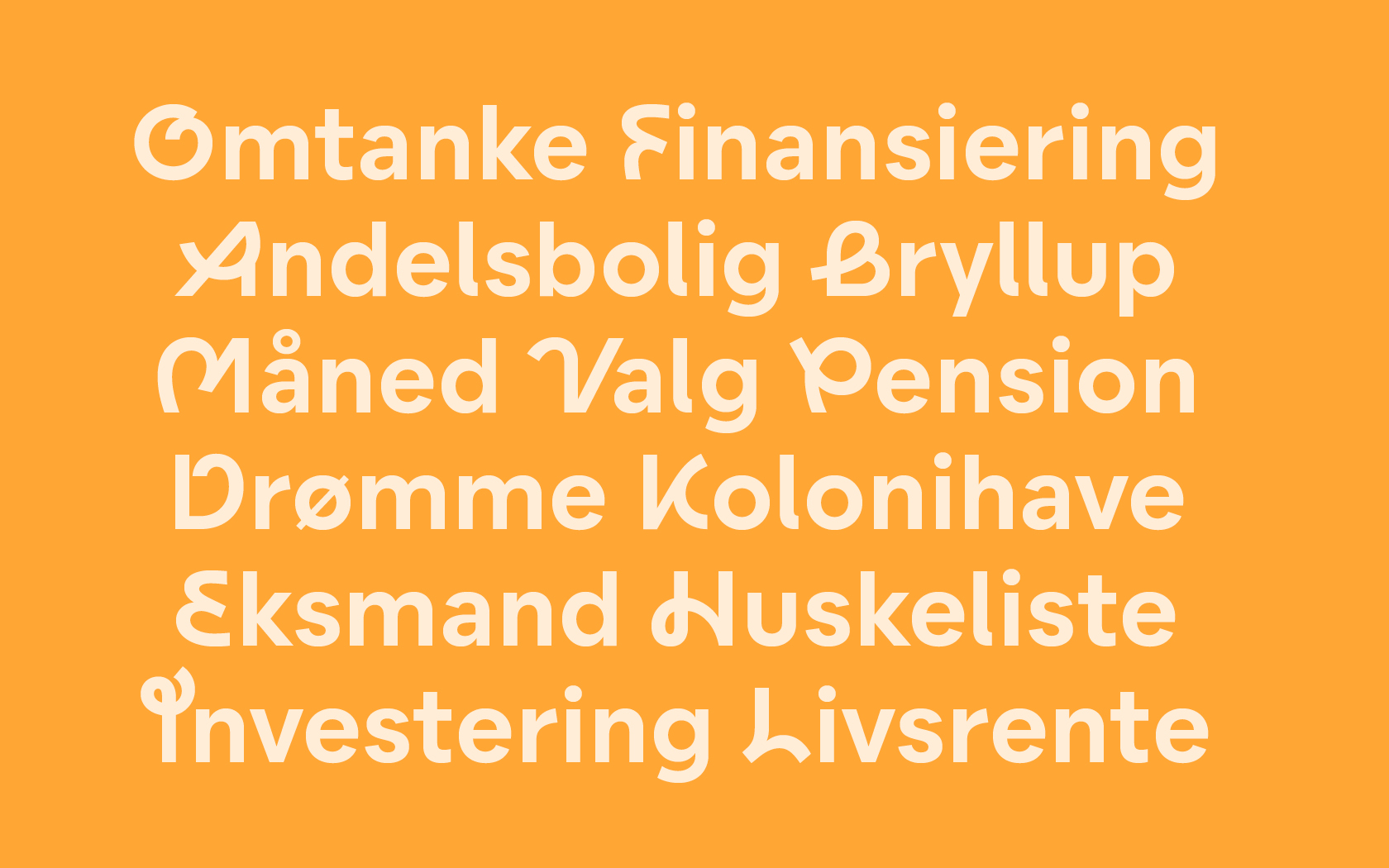
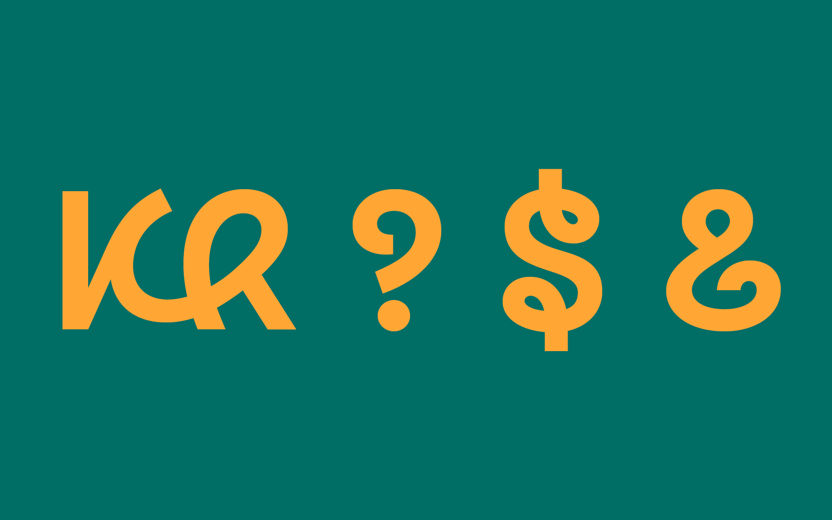
Leading up to Velliv’s launch, design agency Kontrapunkt was tasked with creating its brand identity. We joined in on creating the typeface for Velliv, working with a modern type with a large set of alternate characters. We set out to create a typeface that covers both sides of the company: A modern, easy-to-read main typeface to represent the solidity of a good pension company. All this paired with a set of freely-drawn alternate characters, that gives the typeface its characteristic personality and meets the customer eye to eye.
The brand identity was awarded silver at Creative Circle in 2019.
Collaboration with Kontrapunkt