 Because we know that devoting the time to truly understand the deep mechanics of every client is a crucial first step in creating genuinely good and longlasting work.
 We are (not afraid of being) a small agency. On the contrary – being a small group gives us flexibility and allows us to build closer relations to our clients. Also – it allows us to dedicate more work hours to doing what we do best: creating great and meaningful work.
 or less-than-optimal solutions. We undertake all parts of the design proces and do so with equal passion.
 We really just love what we do!
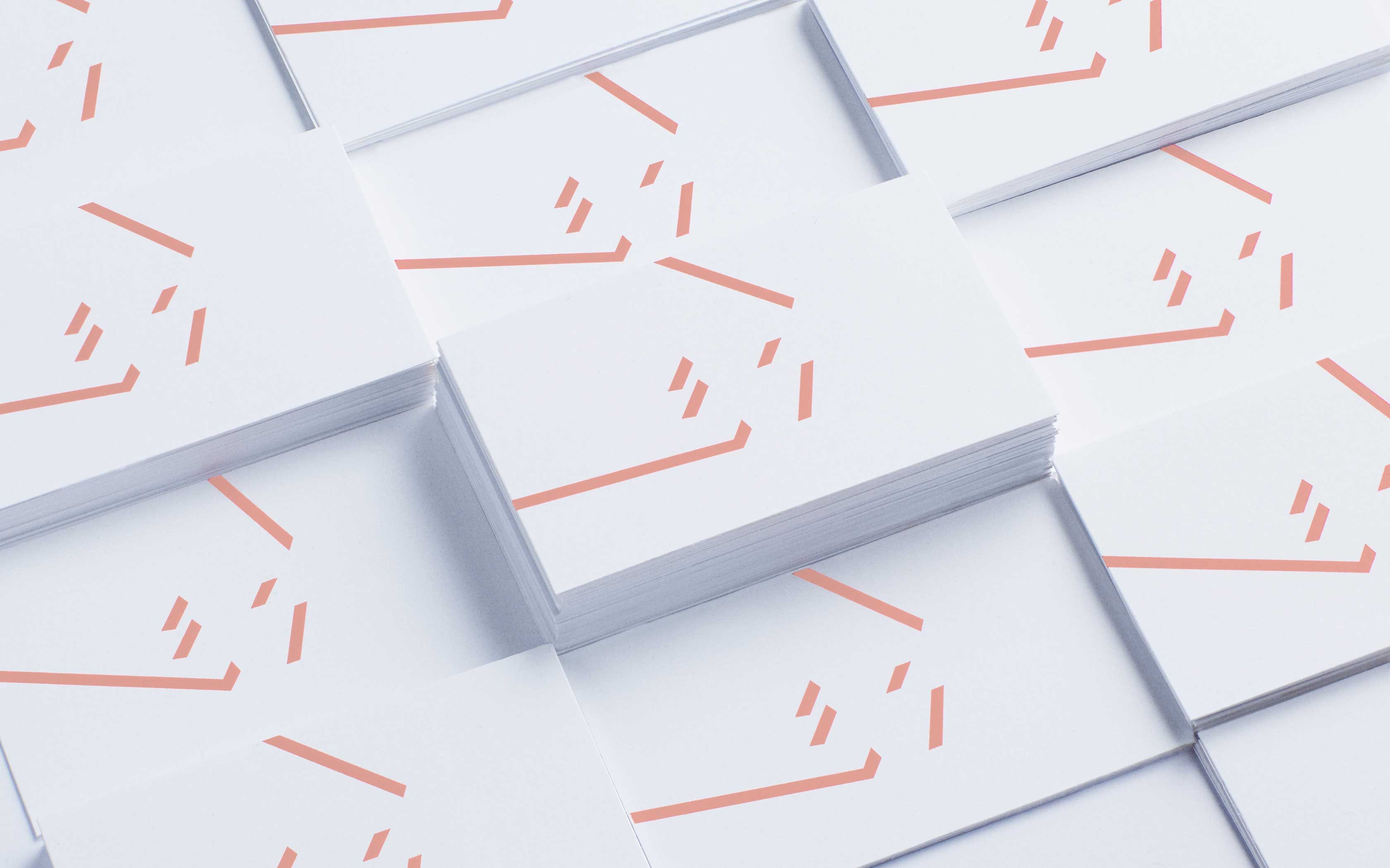
Visual identity for the Chengdu/China based art organization Weiyi
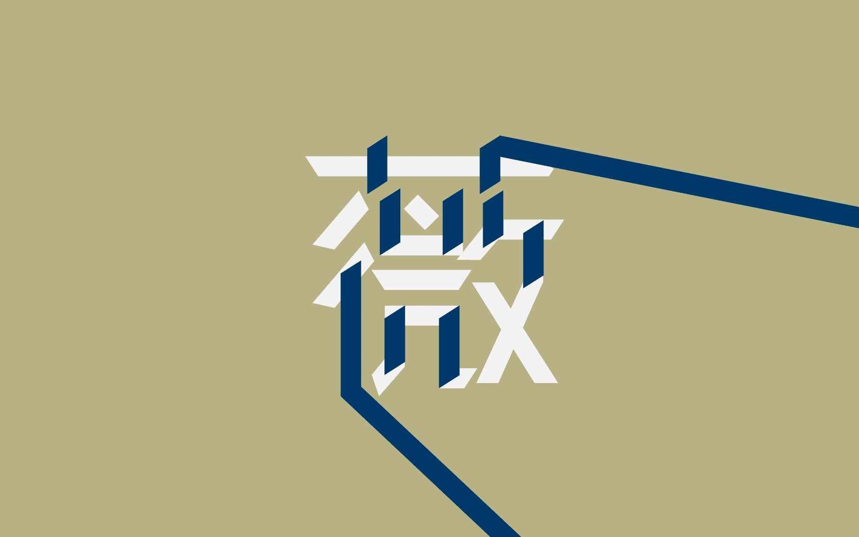
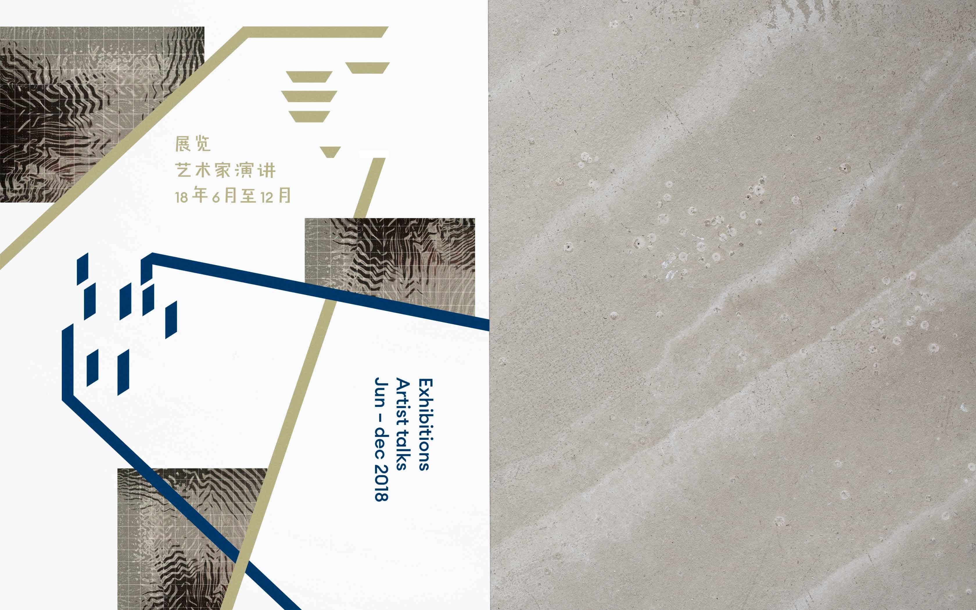
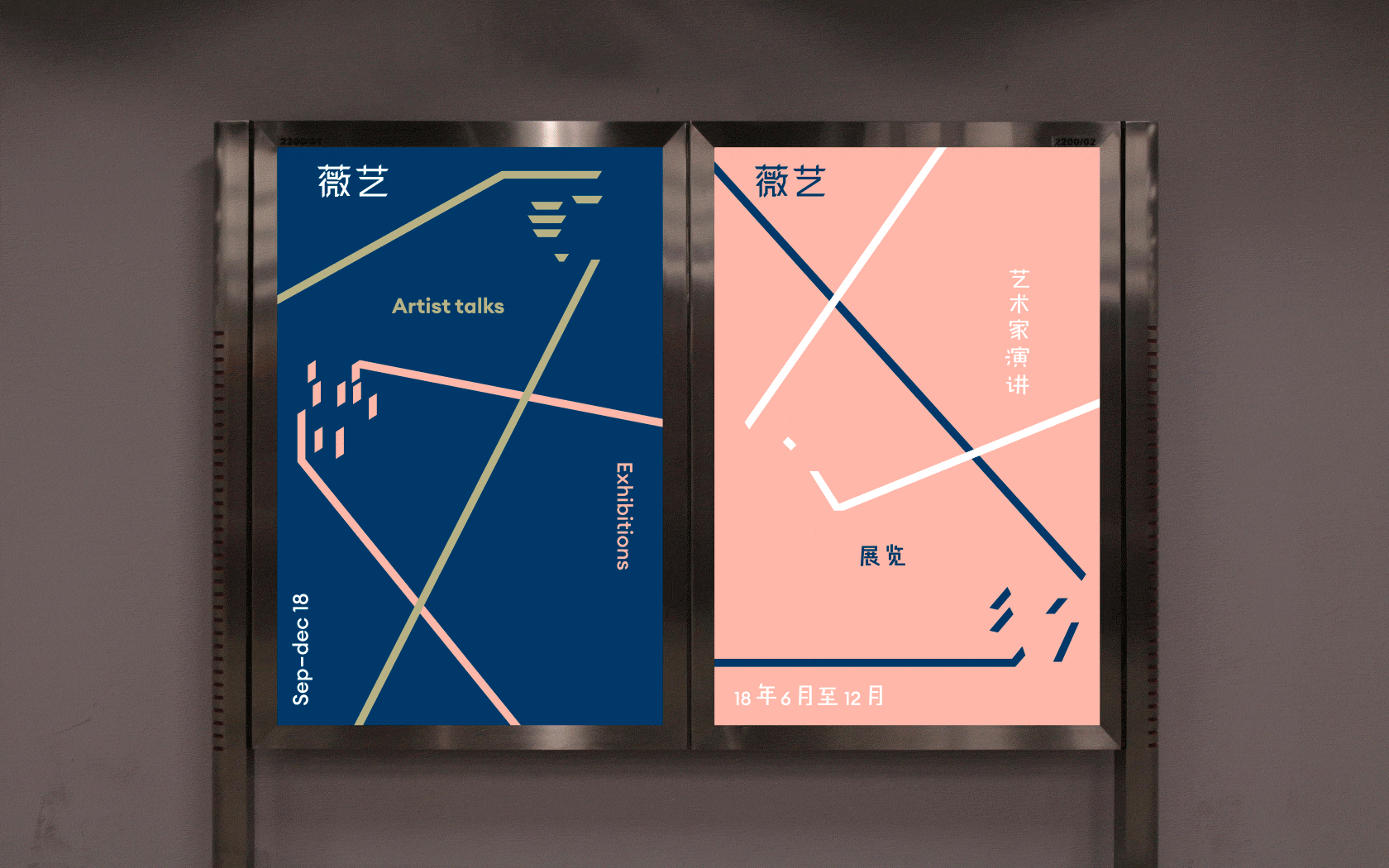
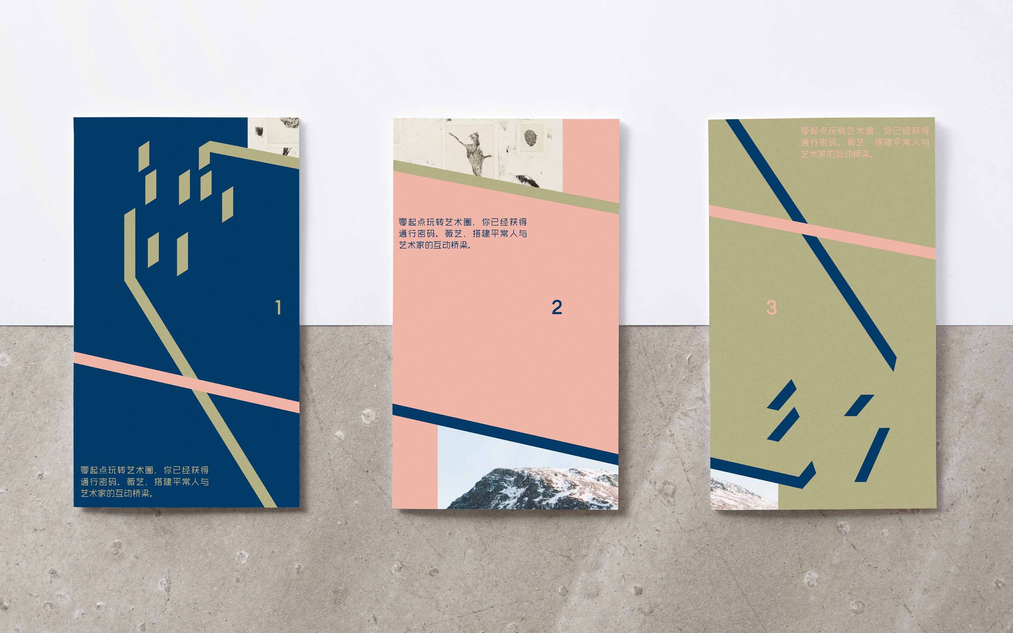
Weiyi is a Chengdu (China) based art organization, with activities involving exhibitions, artist talks and workshops – its name roughly translates: ‘wei’ [beautiful / good] and ‘yi’ [art]. We created the visual identity for Weiyi.
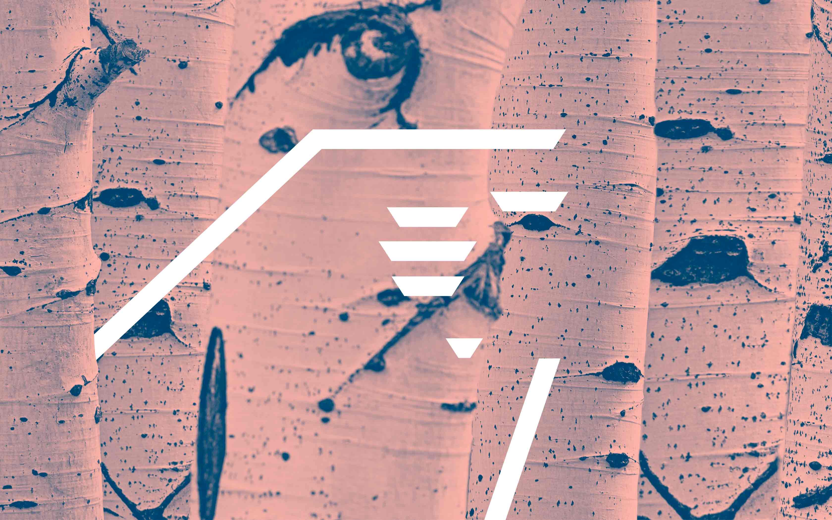
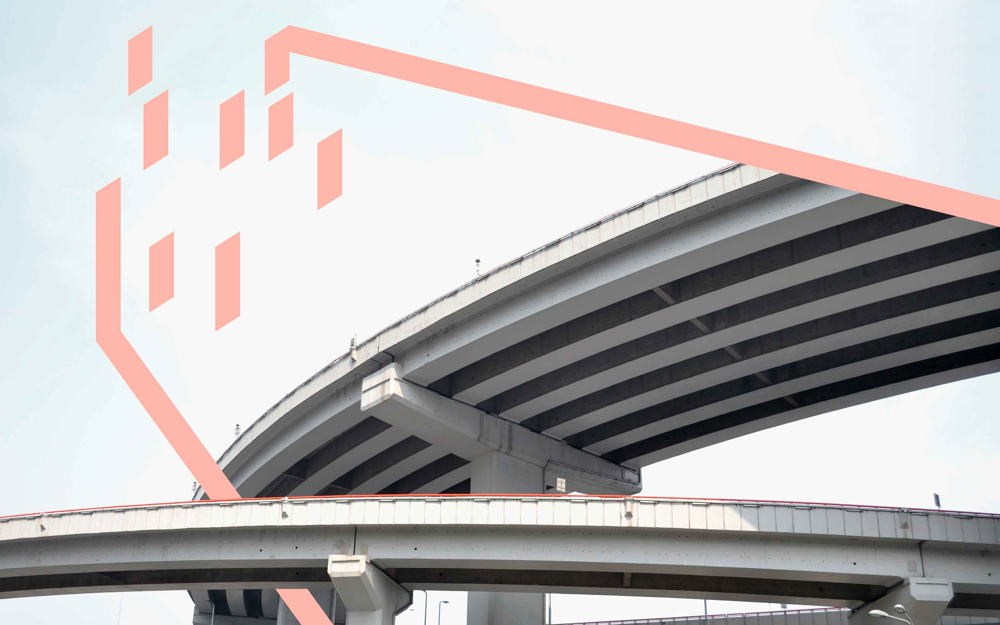
When studying an art piece in a gallery – as we move around, viewing it from different from angles – our perception of it changes. Every new angle reveals differences in the object’s appearance, texture and form. We used the Chinese letter ‘wei’ [beautiful / good] as our object in focus – and created a system of graphics that illustrates how an object changes its appearance as we move around.
Photography by Cecilie Bach
